ADHI AR
TITBIT
Pops on your plate and, you'll never be late!...


summary
Challenge
It is never easy to get snacks in a movie theatre. With loads of people surrounding and a constant threat of the movie being resumed you are always in a urge.
The Goal
Design an app that allows users to order and get snacks while seated. The order process should be simple and quick.
Project Type :
Individual Project
My Role :
UX and UI designer
Duration :
2 weeks
Responsibilities :
Conducting interviews, paper and digital wireframing, low and high-fidelity prototyping, conducting usability studies, accounting for accessibility, and iterating on designs.
About My App
A movie theatre snacks ordering app titled Titbits. We provide all type of theatre snacks at every theatre; customers can place an order, and we'll send the snack in matter of minutes to their seat directly. Titbits directly targets consumers who find it annoying to stand in a crowd and elderly individuals who cannot stand for an extended period of time.


User research
p
QUEUE
Older people find it difficult to wait in lines for long periods of time.
a
p
n
MONEY
Some customers forgot to collect their change from the seller in the rush of the moment, and some lost money while waiting in crowd.
i
o
t
s
TIME
Missing the scenes while waiting in line for a long time.
i
n
Persona: Charoline
![Google UX Design Certificate - Persona [Template] (2).png](https://static.wixstatic.com/media/a75abf_789a6bba8e80441d8000ef519f98324e~mv2.png/v1/fill/w_960,h_540,al_c,q_90,enc_avif,quality_auto/Google%20UX%20Design%20Certificate%20-%20Persona%20%5BTemplate%5D%20(2).png)
Displaying the Charoline’s user journey map and revealing how helpful it would be for the users to access the snack ordering app in the movie theater.
![Google UX Design Certificate - User Journey Map [Template].jpg](https://static.wixstatic.com/media/a75abf_f84c22224f9c4a4196483437b97b0b62~mv2.jpg/v1/fill/w_621,h_349,al_c,q_80,usm_0.66_1.00_0.01,enc_avif,quality_auto/Google%20UX%20Design%20Certificate%20-%20User%20Journey%20Map%20%5BTemplate%5D.jpg)
PLANNING AND DEFINING
STORY BOARDS
Before designing the wire-frame process, I created the story board by doing some researches to understand and visualize the user's experience with my product and the situation.
This 2 type of story board helped me to complete the wire-frames

Close-up Story board

STARTING THE DESIGN
PAPER
WIREFRAME

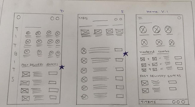
LO-FI WIREFRAME


By clicking this button, it takes to the varieties of snacks which makes the users to pick their favorites snack
This is the popular snacks division where the users find the list of most ordered snacks to order their snacks quickly
Placing the order after checking the cart make users to feel comfort
WIREFRAME
H
I
F
I
_edited.jpg)
_edited.jpg)


After completing the usability studies with lo-fi wireframe I designed the Hi-fi with the users feedbacks.
Iteration 1
USABILITY STUDY: FINDING
I conducted two rounds of usability studies. Findings from the first study helped guide the designs from wireframes to mockups. The second study used a high-fidelity prototype and revealed what aspects of the mockups needed refining.


Round 1 findings
-
To remember what they previously ordered, users need a list of recent orders.
-
Choosing the theater's location is challenging.
-
User felt that payment process was annoying.
Round 2 findings
-
The UI need to be better
-
Color contrast is too high
-
Users want pop up notification for “ADD” button
REFINING THE DESIGN
Before Usability Study

After Usability Study

Home page
To make the home page more visually appealing, I redesigned the whole page by inserting attractive pictures and animations.
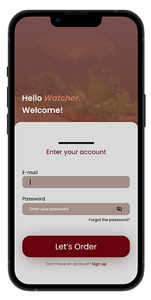
Log-in page
Log-in page designed more interactive by adding swipe up animation.
Before Usability Study

After Usability Study

Before Usability Study
After Usability Study
_edited.jpg)
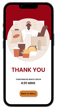
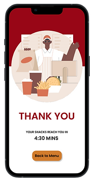
Thank you Page
Thank you page with upscale artwork to increase users' trust.
SCREENS


some
_edited.jpg)
Iteration 2
EVOLUTION OF DESIGN PROTOTYPES

LO-FI Wireframe
Hi-fi - Iteration 1

Hi-fi - Iteration 2
Final design

The final high-fidelity prototype display the easy way of ordering snacks where the users find lots of varieties in one place. Also the users order and get the snacks without any stress and frustration.
View the HI-FI Titbits Snack order app
Accessibility consideration
Used universal icons to help make navigation easier.
Provided access to users who are vision impaired through adding alt text to images for screen readers.
Used detailed imagery for all the snacks and categories the varieties in different screen to help all users better understand the designs.
takeaways
Impact:
The app makes users to feel stress-free and enjoyable while accessing and they feel it’s very helpful.
One quote from peer feedback:
“The app is simple to use and has a nice appearance, which makes me happy. And also, with the help of the varieties in each category, I can order the snacks quickly and easily.”
What I learned:
While designing the Titbits app, I had only the most basic ideas, and I incorporated those ideas into the design. During that time, my confidence level for the app has been very low. After the usability study and peer feedback, I received many positive reviews that improved my confidence level. And also, usability studies and peer feedback influenced each iteration of the app’s designs.
NEXT STEPS
Conduct more user research to determine any new areas of need.
Conduct another round of usability studies to validate whether the pain points users experienced have been effectively addressed.
Regularly Update the app according to usability study and peer feedbacks
Let’s connect!