ADHI AR
UNIQUE-AR
Shop ur own style

summary
Challenge
It is extremely difficult to find an online customizable product with high quality and unique features. The customising steps are so confusing that they make the user feel stressed. We can't always rely on the website for delivery.
The Goal
Design a Unique-AR website to be user-friendly by providing clear navigation and offering a fast checkout process. We can also provide tutorial videos so you can create your own customization. This enables the user to operate freely and calmly.
Project Type :
Individual Project
My Role :
UX and UI designer
Duration :
12 days
Responsibilities :
Conducting interviews, paper and digital wireframing, low and high-fidelity prototyping, conducting usability studies, accounting for accessibility, and iterating on designs.


User research
I conducted user interviews, which I then turned into empathy maps to better understand the target user and their needs. I discovered that many target users are between the ages of 16 and 30; they love to be unique in society. However. no single website can provide users with complete flexibility; some website s have complicated design steps, some have poor quality, and some are distrusted. These lead to annoying state, so the user drops the customization plan and goes with the ready-made app.
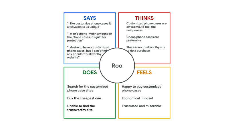
Empathy Map
I created the empathy map according to users' answers to my interview questions. Lots of people felt differently, and from that, I picked out some things that will be useful for my research.
Pain Points
Navigation
Customizing the product is so messy. Lots of options and very small, closely placed icons are there, which leads to confusing navigation.
Customizing
The majority of the website does not allow for complete customization. Many of them just provide predesigned images to add to the cases. Variety is minimum when it comes to customization.
Delivery
Online shopping websites do not provide a reliable delivery service, which frequently results in users receiving incorrectly ordered or damaged goods.
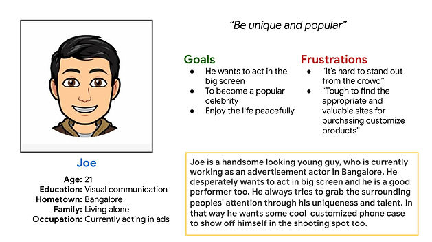
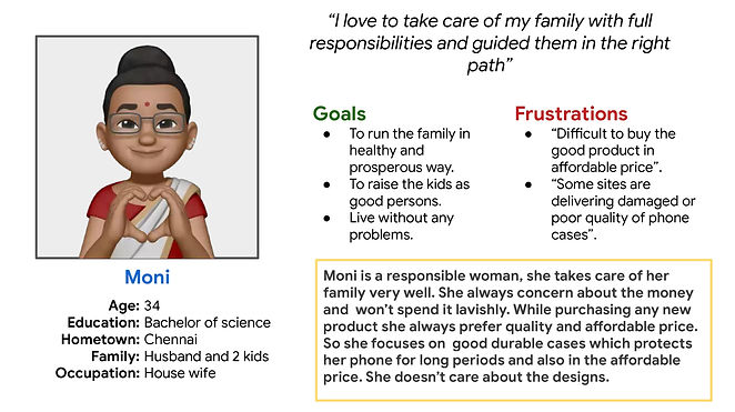
Personas
Designing
User's primary complaint was difficulty in navigating through the website, so I used that information to create a sitemap.
My goal here is to make strategic information architecture decisions that would improve overall website navigation. The structure I chose was designed to make things simple and easy.
Sitemaps

P
a
wireframe
e
p
r
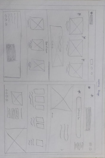

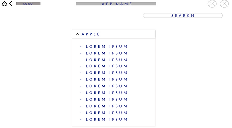
I sketched out paper wireframes for each screen in my app, keeping user pain point about navigation, browsing and check out flow in mind. The home screen paper wireframe variation to the right focus on optimizing the browsing experience for users.
Paper wireframe screen size variations
All the users can’t afford laptops and a few start customising their products with different screens when they find some time. I started to work on designs for additional screen sizes to make sure the site would be fully responsive.
Tablet Screen

Phone Screen
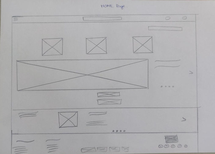
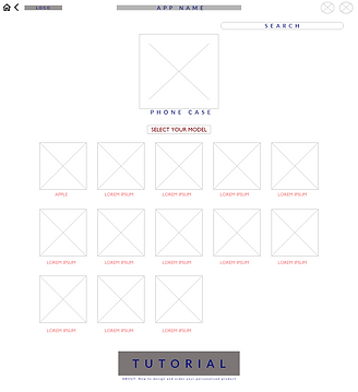
DIGITAL WIREFRAME
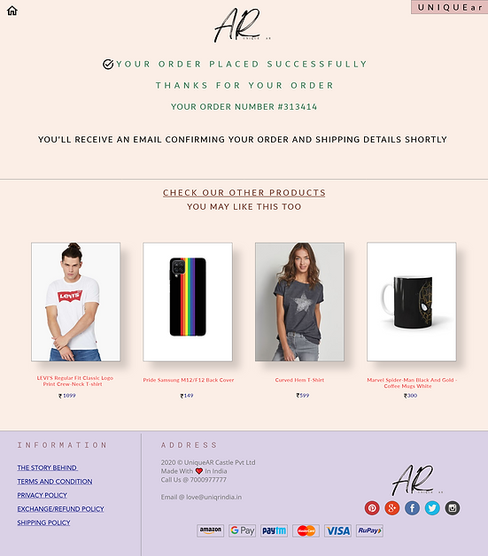
Moving from paper to digital wireframes made it easy to understand how the redesign could help address user pain points and improve the user experience. Prioritizing useful button locations and visual element placement on the home page was a key part of my strategy.

Easy access to know the all offers for the products
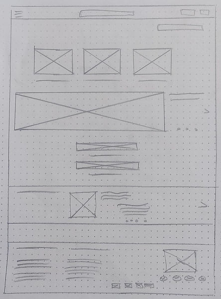
Digital wireframe screen size variations
.png)
.png)
Tablet Screen
Phone Screen
L
O
I
Prototype
F
.png)
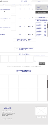
To create a low-fidelity prototype, I connected all of the screens involved in the primary user flow of adding an item to the cart and checking out. At this point, I had received feedback on my designs from members of my team about things like button placement and page organization. I made sure to listen to their feedback, and I implemented several suggestions in places that addressed user pain points.
Lo-fi Screens~


Usability Study
I conducted an Unmoderated Usability study for 3 different age participants around 20 minutes. From the study I collected many different feedbacks. With the help of those feedbacks I worked on my project and improvised it.
Findings~
Users confused while seeing the offers and tutorial buttons. They weren't able to understand the uses of the buttons.
b
u
t
t
o
n
s
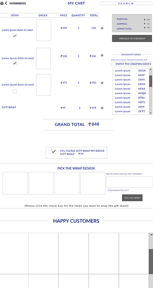
Users felt the my cart screen was so messy and occupied with lots of things.
c
a
r
t
During designing process user may feel confused by seeing the ‘start from scratch’ word and add text, image button.
d
e
s
i
g
n
i
n
g
refining the design
Mockups
1
Based on the insights from the usability study, I made changes to improve the site’s checkout flow. One of the changes I made was adding the ‘about’ text under the tutorial button and justifying the “offers” as a button through the shadows. This allowed users to understand the functions of button without any confusion.
.png)

Before usability study
After usability study
To make my cart more flexible and visually pleasing , I removed the unwanted things from the cart page which helped to improve the user experience.
2
Before usability study

After usability study
Some other Screens~


H
I
H
Prototype
G
.png)
.png)
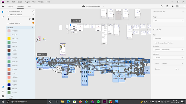
My hi-fi prototype followed the same user flow as the lo-fi prototype with extra screens to make the interaction so easy, and included the design changes made after the usability study.
Accessibility consideration
1. I used headings with different sized text for clear visual hierarchy.
2. I used landmarks to help users navigate the site, including users who rely on assistive technologies
3. I designed the site with 65-35 pics-text ratio to make the user to skim the page easily
Takeaways
IMPACT
Our target users shared that the design was intuitive to navigate through, more engaging with the images, and demonstrated a clear visual hierarchy. They mentioned that the site looks more professional.
I learned that even a small design change can have a huge impact on the user experience. The most important takeaway for me is to organize the text styles, image before starting the designing because that will help to finish the project on time.
What I learned:
Next Step
Conduct follow-up usability testing on the new website.
Identify any additional areas of need and ideate on new features.
Let’s connect!
