top of page
ADHI AR
K
I
N
Hi,There:)
You got a new connection!
_edited.jpg)
SUMMARY
Challenge
People are interacting less with one another in today's world. Most of them prefer online chat. The fear of starting the conversation in person is very high. People in cities rarely interact with their neighbors, which has a significant impact on society and weakens neighbourly bonds.
The Goal
About app
Kin is a platform that connects people. It displays the profiles of the people in their immediate vicinity so that we can begin the conversation via text, which is more convenient for the majority. Later, we can meet the people in person. The main objective of KIN is to overcome the starting trouble.
Project Type :
Individual Project
My Role :
UX and UI designer
Duration :
2 weeks
Responsibilities :
Conducting interviews, paper and digital wireframing, low and high-fidelity prototyping, conducting usability studies, accounting for accessibility, and iterating on designs.
Competitors :

User research
I conducted user interviews with sets of people in different age groups. The users in the age range of 14–25 feel shy to start the conversation in person; only 2 out of 10 have the guts to face everything in the real world; the remaining all prefer the virtual world. According to the feedback I received during my research, users struggle to start a conversation in person, and they needed an app to make it easy and comfortable for them to do so.
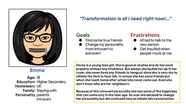
Personas:
![Google UX Design Certificate - Persona [Template] (3).png](https://static.wixstatic.com/media/a75abf_b440a36f024a4e0bad8c9f5a841ce9a8~mv2.png/v1/fill/w_629,h_352,al_c,q_85,usm_0.66_1.00_0.01,enc_avif,quality_auto/Google%20UX%20Design%20Certificate%20-%20Persona%20%5BTemplate%5D%20(3).png)
STARTING THE DESIGN
Ideation
I did a quick ideation exercise to come up with ideas for how to address the gaps identified in the competitive audit. My focus is to make a user-friendly app to allow the users to talk and share the vibe, especially with their neighbors, without any hindrance.
DESIGNING
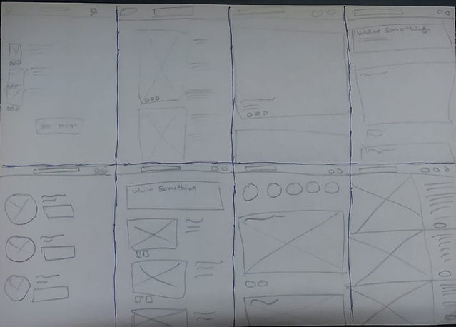
After ideating and drafting some paper wireframes, I created the initial designs for the KIN app. These designs focused on chatting and viewing the profiles of friends.
L
O
I
F
w
i
r
e
f
r
a
m
e


.png)

To prepare for usability testing, I created a low-fidelity prototype that connected the user flow of viewing a page about liking the profile and surfing in the friends feeds.
Prototypes

USABILITY STUDY
I conducted an unmoderated usability study for 7 different age groups over 20–30 minutes. From the study, I collected many different types of feedback. With the help of those comments, I worked on my project and improvised it.
Findings
These were the main findings uncovered by the usability study:


Key Findings
Feeds
People had trouble navigating the feeds because it displayed random feeds where the user preferred their friend's feeds to appear first.
Address
Users don’t want to reveal their addresses publicly without knowing about the other user.
Vibe
Users preferred to show their "love things" list in their own and other's profiles. This feature helps you learn about the stranger quickly.
mockups


_edited.jpg)
1
Based on the insights from the usability studies, I made some changes, like removing the address and making it visible only to their friends after accepting the request and adding new love things in their bio.
The visibility of Address can be toggled on and off by the user.
2
Other design changes included removing the filter from the feed section and displaying the friend's daily feed alone in that space.
.png)
H
I
I
F
p
r
o
t
o
t
y
p
e
_edited.jpg)
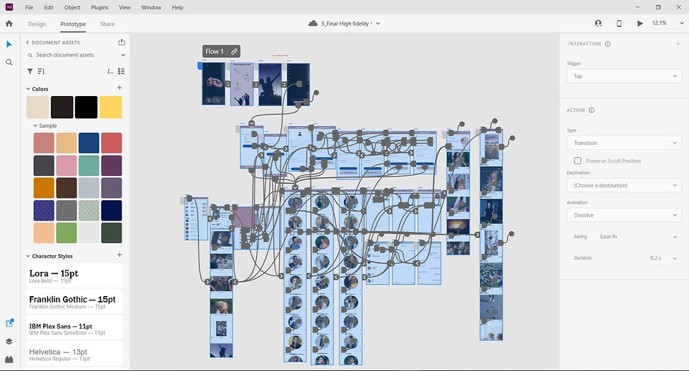
I followed the same user flow, just changing all the designs and interactions from which I got constructive feedback from the first usability study.

PROFILE
MY
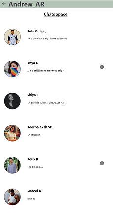
CHATS
PROTOTYPE VIDEO
DEMO

RESPONSIVE DESIGN
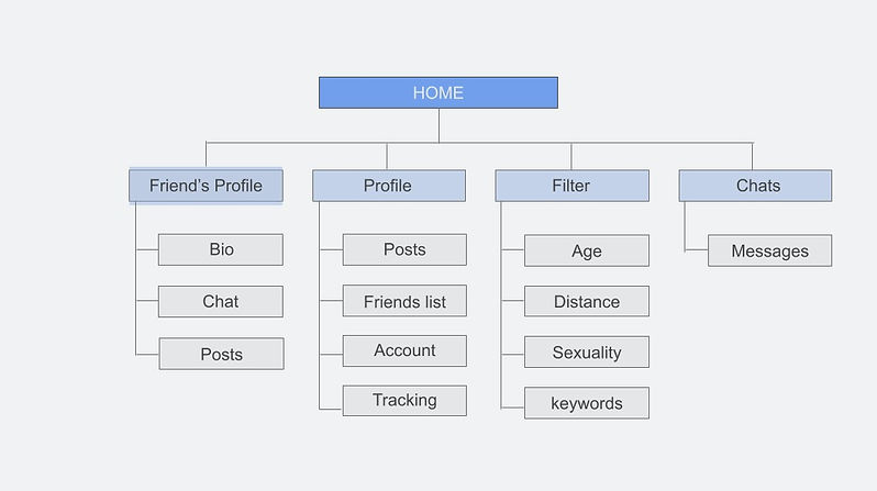
Sitemap~
With the app designs completed, I started work on designing the responsive website. I used the KIN sitemap to guide the organizational structure of each screen’s design to ensure a cohesive and consistent experience across devices.

Responsive screen ~
Phone
.png)
Tablet
.png)
The designs for screen size variation included mobile, tablet, and desktop. I optimised the designs to fit specific user needs for each device and screen size.
Desktop
.png)
Work


.png)


GOING FORWARD
Takeaways~
IMPACT
Users shared that the app could help us get rid of the introverted energy and make us mingle with our neighbors.
"The Kin app might help me to fly in my area with full freedom and I start to know everyone," one peer said.
What I learned:
I learned that even though the problem I was trying to solve was a big one, diligently going through each step of the design process and aligning with specific user needs helped me come up with solutions that were both feasible and useful.
NEXT STEPS
1
Conduct research on how successful the app is in reaching the goal to connect and interact the people..
2
Add more features to make the interaction effective and cool.


Let’s connect!
bottom of page